What Is a KPI Dashboard: Workflow & Examples
What is a KPI dashboard and how do you build one that actually drives results? Learn the workflow, types, real examples, and how to create smarter KPI dashboards with AI-powered tools.
In modern product and business environments, decisions are increasingly driven by data—but raw data alone does not create clarity. Teams often track dozens of metrics across spreadsheets, BI tools, and slide decks, yet still struggle to answer a simple question: Are we on track?
This is where a KPI dashboard becomes critical.
Within Product Lifecycle Management (PLM), KPI dashboards act as visibility layers. They translate strategic objectives into measurable indicators across discovery, development, launch, growth, and optimization. Instead of fragmented reporting, a well-designed KPI dashboard provides a shared source of truth that connects performance to product decisions.
This guide explains what a KPI dashboard is, why it matters, common types, how to design one effectively, and how modern tools like Kuse can streamline KPI dashboard creation and maintenance.
What Is a KPI Dashboard?
A KPI (Key Performance Indicator) dashboard is a visual interface that tracks and displays the most important metrics tied to specific goals.
Unlike generic reports that present large volumes of data, a KPI dashboard focuses on critical metrics that signal performance, risk, or progress. It provides at-a-glance insight into whether strategic objectives are being met.
In product lifecycle contexts, KPI dashboards can monitor:
- Product adoption and usage trends
- Feature performance post-launch
- Development velocity and delivery reliability
- Customer satisfaction and retention
- Financial outcomes tied to product initiatives
A strong KPI dashboard is not simply a visualization tool—it is a decision-support system. It helps teams move from reactive reporting to proactive management.
Benefits of Building a KPI Dashboard
1. Strategic Alignment Across Teams
In cross-functional environments, misalignment often arises because teams interpret performance differently. A centralized KPI dashboard establishes a shared definition of success.
For example:
- Product focuses on feature adoption
- Marketing focuses on acquisition metrics
- Sales focuses on revenue
- Customer success focuses on retention
A KPI dashboard aligns these views around agreed priorities, reducing ambiguity.
2. Faster, More Confident Decision-Making
Without dashboards, performance analysis requires manual data gathering. By the time insights are compiled, the moment may have passed.
KPI dashboards reduce latency between signal and action. When a metric drops or spikes, teams can respond immediately.
This is particularly important in agile environments, where iterative decisions must be made sprint by sprint.
3. Lifecycle Visibility
In PLM, performance signals evolve across stages:
- Discovery → validation rates
- Development → cycle time, defect rate
- Launch → activation and conversion
- Growth → retention and expansion
- Maturity → cost optimization and portfolio rationalization
A lifecycle-aware KPI dashboard helps track performance longitudinally rather than as isolated snapshots.
4. Early Risk Detection
KPI dashboards enable pattern recognition. Small changes in engagement, quality, or efficiency can signal deeper issues.
For instance:
- Rising support tickets may indicate UX friction.
- Increased cycle time may reveal scope creep.
- Declining feature adoption may signal misaligned prioritization.
Without dashboards, these risks surface too late.
Types of KPI Dashboards
KPI dashboards are not one-size-fits-all tools. The structure, granularity, and visual emphasis of a dashboard should reflect the role of its audience and the decisions it is meant to support. A well-designed KPI dashboard is contextual—it prioritizes different metrics depending on whether the goal is strategy alignment, operational execution, or growth acceleration.
Executive KPI Dashboard
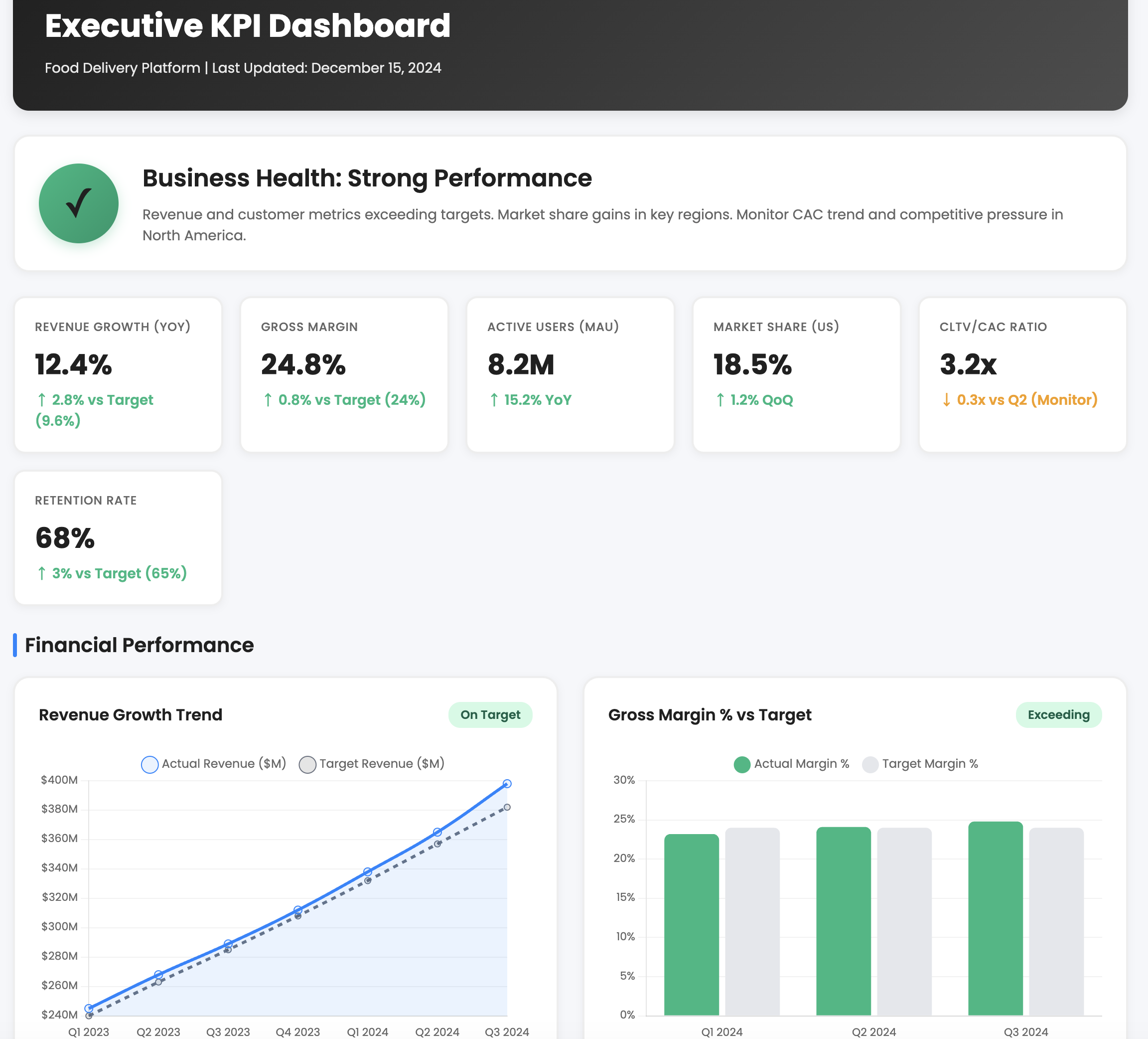
An executive KPI dashboard is designed for leadership teams and board-level stakeholders. Its primary function is strategic clarity. Rather than overwhelming executives with granular operational data, this dashboard focuses on high-level outcomes that signal whether the organization is moving in the right direction.
Typical metrics include revenue growth, gross margin, customer lifetime value, retention rate, portfolio performance, and major initiative milestones. The emphasis is on trend direction and variance from targets, not tactical details. For example, an executive dashboard might show quarterly recurring revenue growth alongside churn rate trends to highlight whether expansion is sustainable.
The defining characteristic of an executive dashboard is simplicity paired with strategic relevance. It should answer: Are we winning? Are we at risk? Where should leadership intervene?
Operational KPI Dashboard
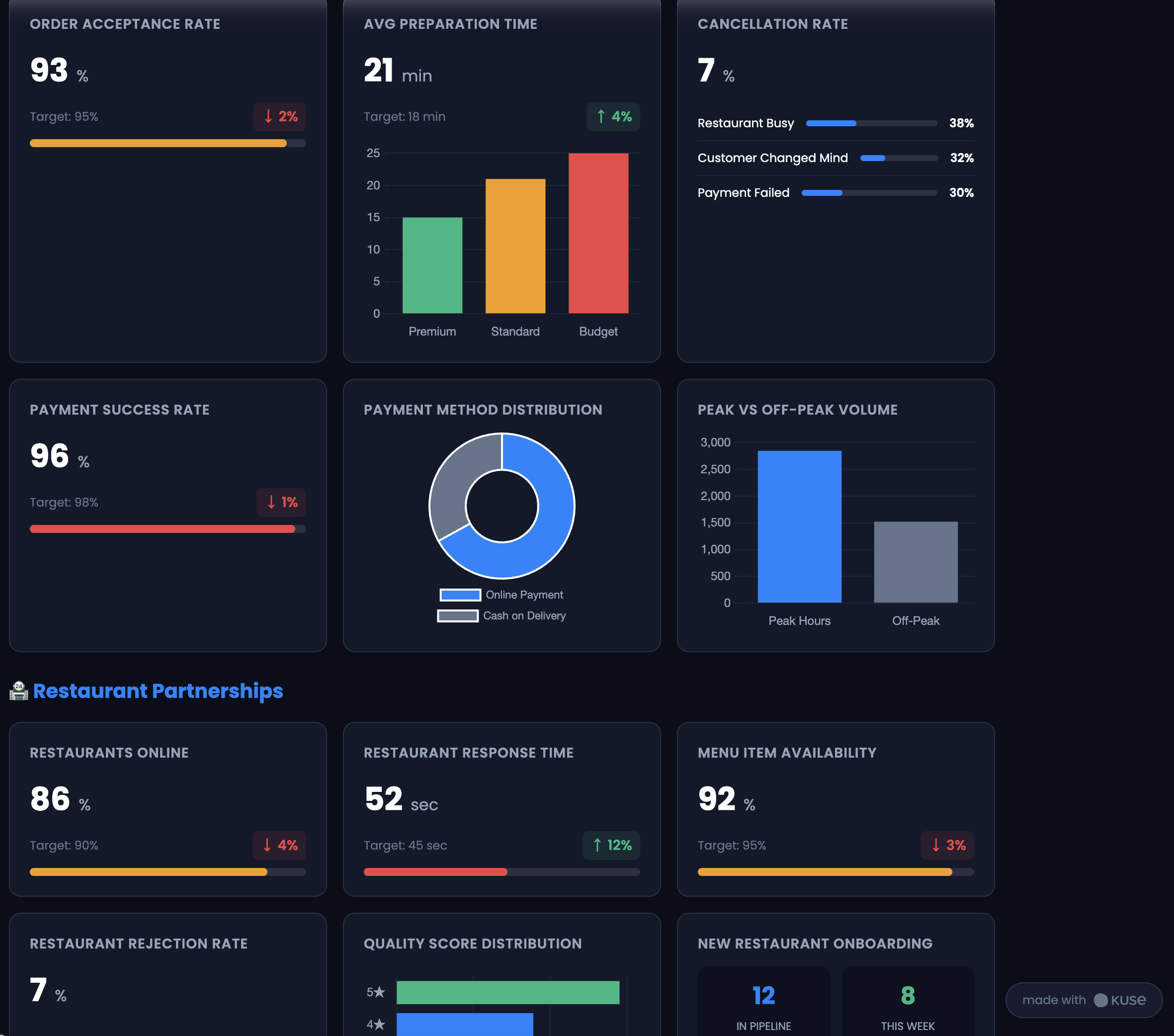
Operational dashboards serve frontline managers and execution teams. Unlike executive dashboards, these emphasize process health and execution reliability.
In a product organization, this might include sprint velocity, deployment frequency, defect rate, support response time, and resource utilization. In manufacturing environments, it could track cycle time, downtime, throughput, and quality yield.
The goal is not long-term strategy but short-term performance stability. Operational dashboards provide daily or weekly visibility into whether workflows are functioning efficiently. They are particularly useful for identifying bottlenecks early—before they escalate into strategic problems.
Where executive dashboards look at outcomes, operational dashboards monitor the mechanisms that produce those outcomes.
Product Performance Dashboard
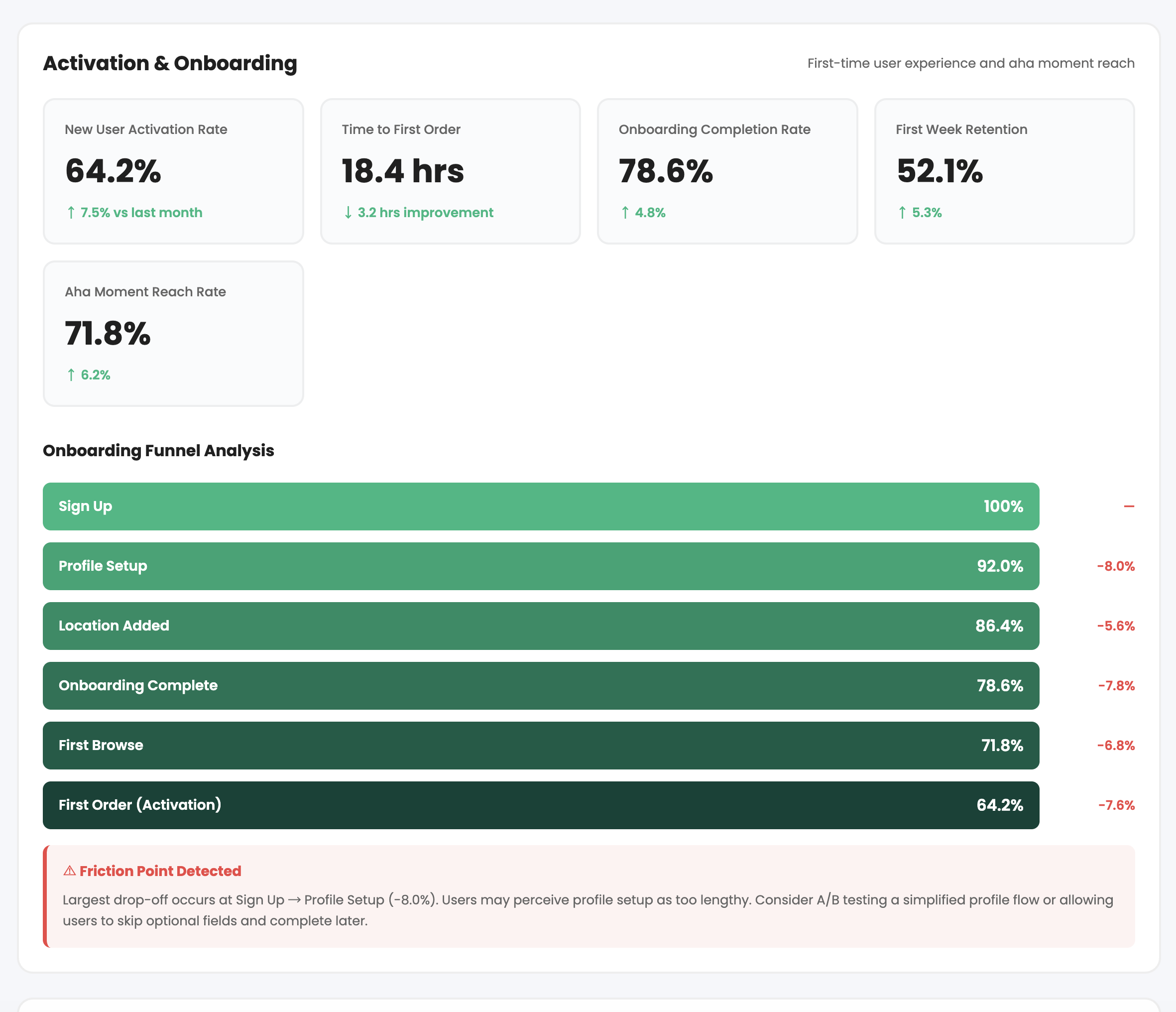
A product performance dashboard focuses specifically on user behavior and product-market alignment. This is particularly critical in digital or SaaS products where usage signals determine long-term viability.
Metrics commonly include daily and monthly active users (DAU/MAU), feature adoption rates, activation metrics, retention cohorts, churn percentage, and engagement depth. Rather than presenting vanity metrics, this dashboard should surface behavioral insights that inform roadmap decisions.
For example, if a newly launched feature has high initial usage but low repeat engagement, the dashboard can reveal friction or value gaps. This allows product managers to iterate quickly rather than relying on anecdotal feedback.
In the product lifecycle, this dashboard becomes most critical during launch, growth, and optimization phases.
Marketing & Growth KPI Dashboard
Marketing and growth dashboards connect go-to-market efforts to product impact. These dashboards bridge acquisition activities with revenue and retention outcomes.
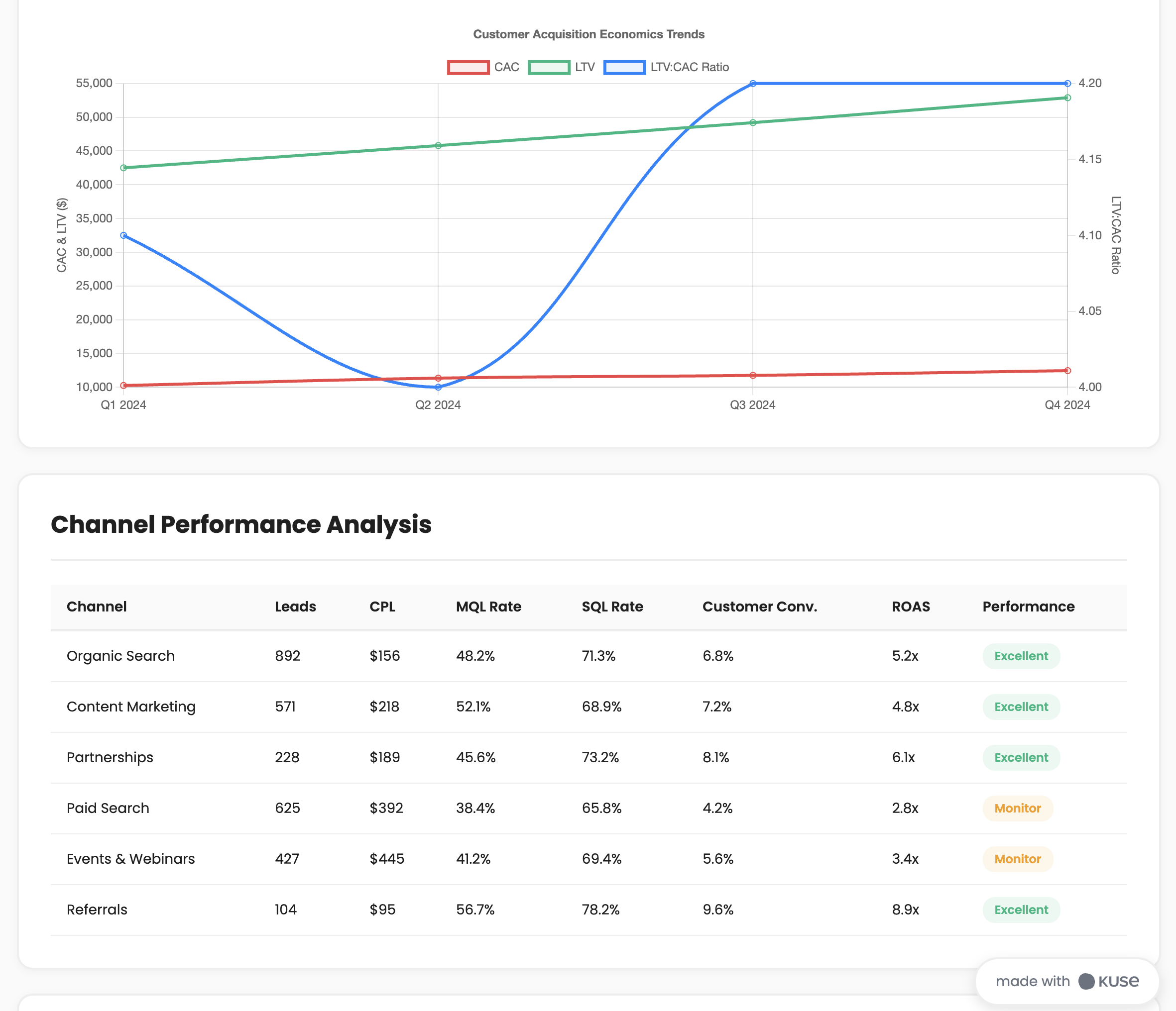
Metrics often include customer acquisition cost (CAC), conversion rates across funnel stages, marketing-qualified leads (MQLs), return on ad spend (ROAS), traffic source breakdowns, and pipeline velocity.
The distinguishing feature of a growth dashboard is its focus on flow—how prospects move through the funnel and where friction occurs. It helps teams understand not just how many users they acquire, but how efficiently acquisition converts into long-term value.
When integrated with PLM, growth dashboards help align product development priorities with real demand signals.
Project & Delivery Dashboard
Project or delivery dashboards focus on timeline integrity, scope control, and budget performance. These dashboards are especially valuable during development-heavy lifecycle stages.
Metrics may include milestone completion rates, planned vs. actual timelines, burn-down charts, budget variance, risk flags, and change request volume.
This type of dashboard answers: Are we delivering what we promised, on time and within scope?
In complex product environments, delivery dashboards ensure that strategy does not drift due to execution instability.
How to Build a Successful KPI Dashboard (Step-by-Step)
Designing a KPI dashboard requires more than selecting metrics and placing them into a visualization tool. It is a strategic exercise that forces clarity about priorities, accountability, and decision-making workflows.
Below is a more detailed breakdown of how to build a dashboard that actually drives performance.
Step 1: Start With Strategic Intent
Before selecting metrics, clarify the decision context.
Ask yourself:
- What problem are we trying to monitor?
- What decisions will this dashboard influence?
- Who is the primary audience?
- What time horizon does it serve—daily, quarterly, annually?
A KPI dashboard built without strategic clarity becomes a reporting artifact rather than a management tool.
For example, if the objective is to improve product retention, the dashboard should emphasize cohort analysis, churn segmentation, and engagement depth—not generic traffic metrics.
This step ensures alignment between metrics and business outcomes.
Step 2: Translate Goals Into Measurable KPIs
Strategic goals must be operationalized. This means converting abstract objectives into measurable indicators.
If the goal is “improve customer satisfaction,” you must define what that means:
- Net Promoter Score (NPS)
- Customer Satisfaction Score (CSAT)
- Support resolution time
- Renewal rate
Each KPI should have:
- A clear definition
- A calculation formula
- A target benchmark
- A responsible owner
Ambiguous KPIs undermine dashboard credibility. Precision builds trust.
Step 3: Balance Leading and Lagging Indicators
A strong KPI dashboard blends predictive and outcome metrics.
Lagging indicators show what has already happened—revenue, churn, profit margin.
Leading indicators suggest what is likely to happen—trial conversion rate, feature engagement, onboarding completion.
For example, declining onboarding completion today may predict churn in future months. By monitoring leading indicators, teams gain early intervention opportunities.
A dashboard that tracks only lagging metrics becomes reactive. A balanced dashboard becomes proactive.
Step 4: Design Around Signal Clarity
Visual design should prioritize interpretability over aesthetics.
This means:
- Using consistent color coding for thresholds (green/yellow/red)
- Showing trend lines rather than single-point data
- Highlighting deviations from targets
- Avoiding excessive chart types or decorative visuals
A good KPI dashboard should allow a decision-maker to understand performance within seconds.
Clarity reduces cognitive load and accelerates action.
Step 5: Define Update Cadence and Governance
Even the best dashboard fails without maintenance.
Determine:
- How often data updates (real-time, daily, weekly, monthly)
- Who verifies accuracy
- Who owns metric definitions
- How changes are communicated
Governance prevents KPI drift—when definitions subtly change over time, undermining trust.
In PLM environments, governance ensures lifecycle metrics remain consistent across stages.
Step 6: Connect KPIs to Action Loops
A KPI dashboard should not be passive. It must trigger decisions.
Define:
- Thresholds that require review
- Escalation paths for underperformance
- Regular review cadence (e.g., weekly product review, monthly exec sync)
- Documentation of decisions tied to KPI shifts
For example, if feature adoption drops below 40%, the team may trigger a usability review. This transforms dashboards from reporting tools into performance engines.
Step 7: Continuously Refine and Evolve
As products and organizations grow, KPI dashboards must adapt.
New lifecycle stages, market conditions, or strategic pivots may require metric updates. Periodically review:
- Which KPIs drive real decisions?
- Which metrics are noise?
- Are we measuring outcomes or activity?
The best KPI dashboards evolve alongside product strategy.
How to Build a KPI Dashboard More Efficiently with Kuse
Traditional dashboard creation often requires juggling spreadsheets, BI tools, documentation, and meetings. Kuse helps streamline the knowledge and alignment layer behind KPI dashboards.
1. Centralize KPI Definitions
Upload:
Strategy documents
OKRs
Product requirements
Performance reports
Kuse can extract and structure KPI definitions consistently across teams, ensuring shared understanding.
2. Generate KPI Framework Drafts
You can prompt Kuse to create structured KPI dashboards aligned with lifecycle phases:
Example Prompt:
“Create a KPI dashboard framework for a SaaS product across discovery, development, launch, and growth stages. Include leading and lagging indicators.”
Kuse generates:
Metric categories
Definitions
Suggested formulas
Ownership suggestions
3. Align KPIs with Roadmaps and PLM Artifacts
Because Kuse connects to product documentation, teams can:
Link KPIs to specific roadmap initiatives
Map performance metrics to requirements
Generate executive summaries automatically
This ensures KPIs are not disconnected from lifecycle decisions.
4. Produce Shareable Outputs
Kuse can convert KPI structures into:
Executive-ready summaries
Visual documentation
Structured reports
Webpage-style interactive outputs
This reduces time spent preparing updates while preserving clarity.
Conclusion
A KPI dashboard is more than a collection of charts—it is a decision architecture.
When aligned with product lifecycle stages, it provides clarity across strategy, execution, and performance. It enables faster decisions, earlier risk detection, and stronger alignment between teams.
In increasingly complex organizations, dashboards serve as the connective tissue between vision and results. When built intentionally—and supported by tools that preserve context—they become one of the most powerful mechanisms for managing product success.